
A Touch from Beyond
A Touch from Beyond is a unique service that allows those pre-planning their death to send sentiments to their loved ones after they depart.
As a team, we were tasked with creating a new e-commerce website for this product as the current site is outdated and not functional for online orders and purchases.

A Touch from Beyond cards
Each card is made of high quality card stock, foil emboss of the trade-marked joining hands logo, comes in high quality envelopes.
Research
This is the most important part of the design and to me the most interesting. Having a good research plan ensures that you have great analysis, design process, and final product.
We started off this phase by carrying out user interviews with potential stakeholders and some who work in the End of Life industry such as Psychotherapist, Grief and Bereavement Specialists, and End-of-life Doulas (this was the first time the team learned that doulas specialize in areas other than labor).
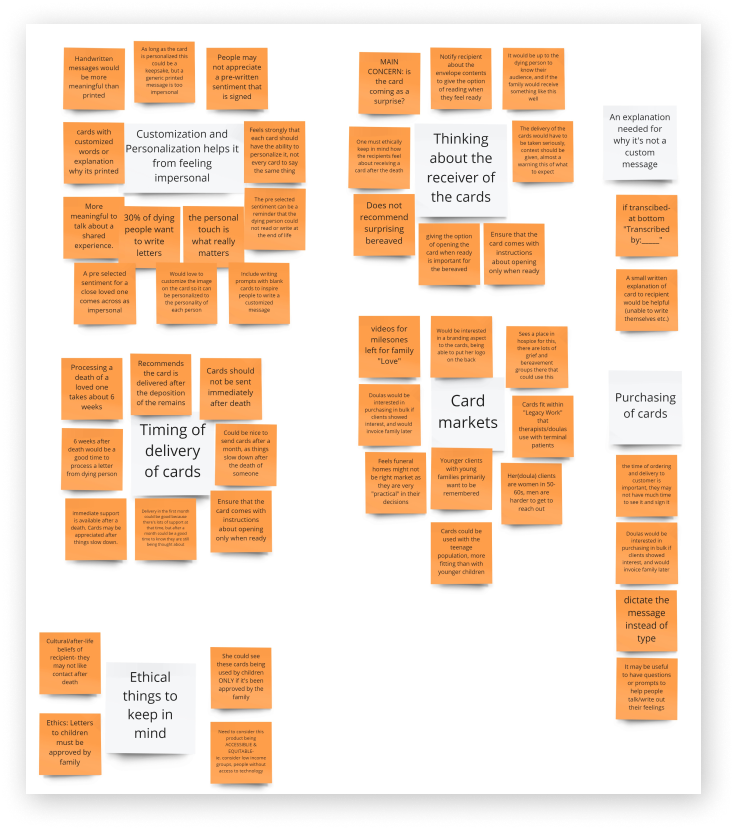
To organize data and insights collected from the user interviews we put together an affinity map.

Next we created empathy maps for each customer group, as by now it was apparent the website has two types of customers, to gain a deeper insight into customers.
We needed to define the customer journey and experiences with the A Touch from Beyond brand across all touchpoints. To visually represent this we drew up a journey map.

Competitive Analysis: was carried out to see what other websites or applications work in the same industry, which we have come to learn is called Legacy work. We found 3 similar products, all offering digital products only.
Accessibility Analysis: From our interviews, it was apparent that most customers of Legacy work, are females in their early 60s. Therefore, we have to adhere to accessibility rules and guidelines, especially concerning font size and contrast, color, animations, and images.
Next steps, we defined the business model of the site using the Business Canvas Model and the value proposition of the website using the Value Proposition Canvas which helped us ensure that the product is positioned around what the customer values and needs.
We also defined the information architecture of the website which helped us organize how to display the data and design the site map.

Now comes the fun part…
This is where all those creative juices have been dying to run and bring their magic. We started with creating 3 different mood boards, different typography concepts, and then different concepts of low fidelity wireframes/sketches, for the client to choose from. Low fidelity wireframes were created with various tools such as Figma, Balsamiq, and the classic pen and paper

Low Fidelity wireframes made with Figma

Low Fidelity wireframes made with Balsamiq and another sketched out on paper

Again 3 concepts in High Fidelity were designed after the client’s feedback on all low fidelity wireframes.
The challenge here was matching our design with available themes in Shopify, as that is the tool of choice to build the e-commerce website. So we reverse-engineered the process. We looked at templates in Shopify then created our wireframes according to those themes.
Usability Testing
This is where we test and validate our design and prototype with potential stakeholders and users for two major areas: understanding the purpose of the website and usability testing focused on accessibility and functionality.
We asked our interviewees in the Research
The user tests included questions about identifying what the website is about, the readability of text, the amount of text on each page, and some tasks that tell us how easy users can find information and complete a purchase order of bulk amounts of cards.
The results were positive and provided great insight into changes we can corporate into the final site to make the experience even more positive
The Grand Reveal
Drum roll, please……
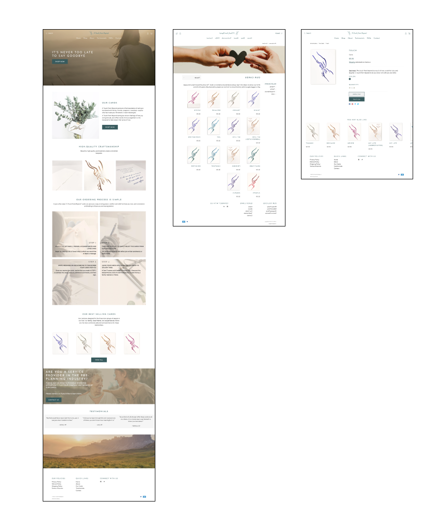
A Touch from Beyond is live and accepting orders.